Showing posts with label case study. Show all posts

Tuesday, 4 January 2011

Freeman's Meadow, Leicester


I had originally intended to post these pictures at Christmas to give the blog a bit of a seasonal feel. However, the fact that we actually had snow, lying right across the UK for the whole festive period, rather kerbed my enthusiasm.


Freeman’s Meadow is one of those schemes that I’d been seeing in brochures and regeneration publications for some time, but hadn’t got round to visiting, despite being pretty close to my home. Located on a former industrial, brown-field site, close to the centre of Leicester and adjacent to the River Soar, it’s an archetypal regeneration, come “urban renaissance” project. While it’s easy to be sniffy about this kind of thing, in the context of Leicester, I do thing the regeneration of this part of the city has been welcome, in particular opening up access and development to the River Soar which has been hidden and enclosed by crumbling industrial uses. I’ve always felt that Leicester turns it’s back on the River, and am pleased to see this being reversed (albeit fairly slowly).

Hence, having finished work for Christmas 2009, I decided to drop by for a visit on my way home. And that’s when it started snowing...

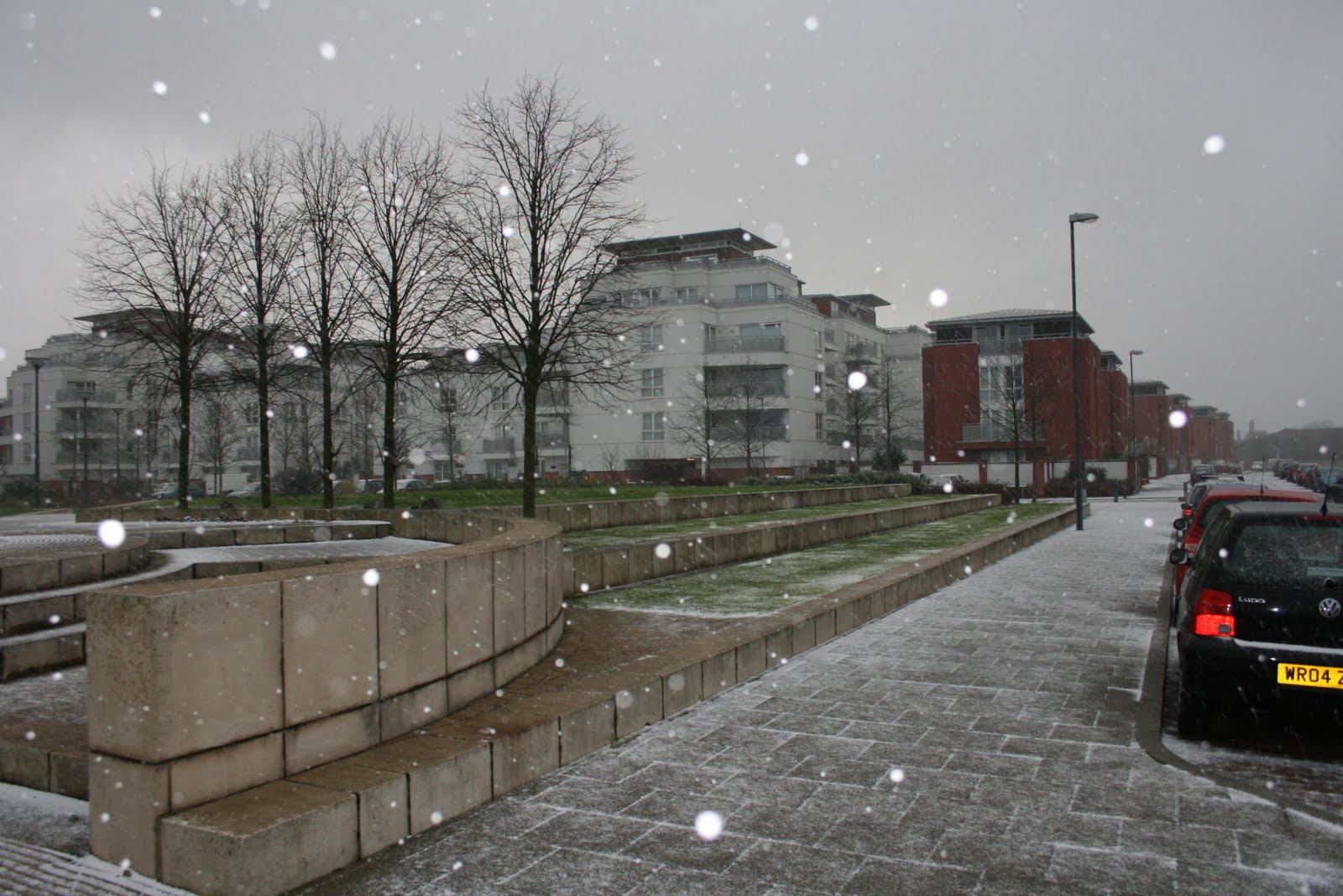


In truth I was rather underwhelmed, but somewhat typically, didn’t actually get round to writing something caustic, as I had originally intended. Given that some months later the scheme was entered for the East Midlands section of the UK Landscape Awards 2010 (http://www.uklandscapeaward.org/), of which I was a judge, this probably wasn’t a bad thing. Whilst not amongst the winners, it was commended and after further consideration, I think correctly so. I later went on to judge the English entries to the awards and it was noticeable that the great majority of schemes submitted were either strategic, or rural/coastal landscape restoration schemes. Very few were urban based or involved actual implementation of designs, which I found telling.

OK, so I admit that I have rather conflicting feelings about this, but here goes:

Architecturally, I don’t think it’s going to be getting too many people that excited. However, I do think that as a form, the squat apartment blocks set amongst gardens, is a very appropriate treatment for it’s urban location in Leicester. Certainly a lot more so, than the overgrown brick boxes, arranged in cul-de-sacs, that predominate the surrounding Bede Island area. I also think that they are likely to be more appealing to people, than the city centre flats above, car parks, shopping malls and takeaways, that are currently lying unoccupied across the city (and indeed the country).


From a landscape perspective, it’s very positive that so much effort has been expended on the external spaces and this is why the scheme has been recognised with an award. The materials are high quality and frequently bespoke in nature. The design, by my former colleagues at Capita Lovejoy, is both tasteful and very well detailed. However...

... as a designer, a purist, and a pedant, I do think there are issues with the design. Whilst the bleak midwinter is probably not the best time to look at most schemes, my feeling is that the spaces probably won’t be used much. I find them rather disconnected from the surrounding buildings. This really goes to the heart of why I write this blog; my belief that landscape architecture is about more than providing a pretty setting for buildings, that it has actual and tangible function in it’s own right. Unfortunately, I’m just not sure that this scheme really is much more than an attractive setting for the buildings. :(


I think cars and how they are accommodated is a big issue for this kind of housing development. My abiding memory of visiting Freeman’s Meadow, was that there were cars everywhere. It’s something of a paradox, that if you don’t make adequate provision for cars (mainly by providing parking spaces), they end up dominating the street scene. From a design perspective, I think the ideal is underground parking (as seen at Greenwich Millennium Village), but this is often prohibitively expensive for most projects.

Conversely, I think that roads and in particular, the provision of fire and service access, are too often the overriding consideration in the design of external spaces. One of the things I like about shared spaces is that you can have access to buildings for fire and servicing, but you aren’t left with a mean, bisected space adjacent to the buildings, for pedestrians. I think this problem is well illustrated here, as residents have to negotiate a line of car parking, a road and then another line of car parking, if they want to get from their front door to the central space or the playground.


For all it’s faults, my opinions of Freeman’s Meadows and other developments of it’s ilk, are mellowing. I’m unsure what the next few years will bring in terms of urban redevelopments, but I suspect we could end up looking back with wistful affection on this sort of scheme.


Tuesday, 15 June 2010

City Lounge, St. Gallen


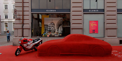
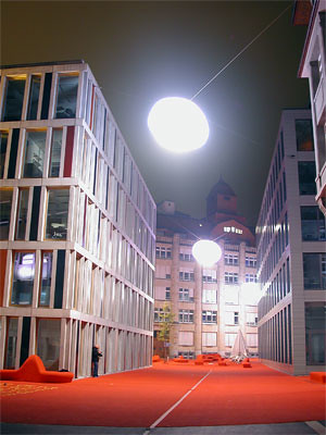
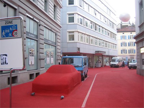
City Lounge is an outdoor living space in the centre of St. Gallen, Switzerland, created by artist, Pipilotti Rist and architect Carlos Martinez. Originally intended as a temporary installation to celebrate the pedestrianisation of the city's business district, it was so popular, it became a permanent feature.

I first spotted it in Llorenc Bonec's excellent, Urban Landscape Architecture, which is full of interesting schemes to brighten up your coffee table or reception area!

I've managed to scrounge together a few images from across the interweb (see below), but if you like the look of it, I'd recommend you visit the website of photographer, Thomas Mayer.

http://thomasmayerarchive.de/categories.php?cat_id=1025&l=english


Tuesday, 6 October 2009

Ashford Ring Road, Shared Space


Whenever we hear about the rights and wrongs of shared space being debated in the media, one scheme seems to be mentioned more than others – the Ashford ring road. Jeremy Clarkson hates it, I suspect Guide Dogs for the Blind aren’t too keen and local residents have complained that someone will surely be killed! I thought it was worth checking out…

Geek that I am, I actually arranged to spend the night in Ashford before I headed off to France for my hols the following day. Unfortunately, traffic and the British weather conspired against me and I ended up arriving in Ashford at about half past nine, on a dark and rainy night. As a result I didn’t get any decent photo’s (and hence why I’ve included a few from around the interweb) and I probably missed a few of the schemes intricacies.


It’s an interesting design, and perhaps not quite as radical as I’d imagined it to be. The thought of making a ring road a shared space, conjured up images of pedestrians trying to get across a dual carriageway. In reality it’s not quite as dramatic as this, and it’s pretty much a standard stretch of urban road that’s been given the shared space treatment. That said, Ashford have gone for the full shared space package – no kerbs and some big spaces where cars and pedestrians can intermingle. Personally, I think you can achieve a lot whilst still having some small kerbs and I’m not convinced that big spaces with cars and pedestrians mixing, are necessarily the best idea.


However, I’d imagine that on a nice day it’s an attractive scheme with lots of new street trees, and I particularly liked the look of some of the hard detailing. However the biggest surprise for me is the abundance of some seriously wacky public art. One of the key concepts of shared space is that by making drivers feel unsure and even uncomfortable, you reduce their speed and ensure that they behave with more consideration for other road users. Hence, I can understand the rationale for incorporating some art features. However, I think that there is also a danger that you will also make pedestrians also feel uncomfortable, by including so many seemingly incomprehensible features. I’m just not sure that the combination of rather frivolous art, and a pretty serious change in road safety policy, is a great idea. It doesn’t exactly inspire confidence and I’m not particularly surprised that so many local users have been baffled by the whole thing. I would also imagine that it rather reinforces the idea that the Council have ‘gone mad’.


The worst offender by far, is the ‘Notaroundabout’ installation (not a round about, how clever). The image below was emailed to me with just two accompanying words. Utter tosh. It looks to me like someone’s buried a rusting, miniature observatory in a giant, patio recreation of a Moorish garden.


Despite all of I’ve said, I’d still be interested to visit the scheme again – ideally in daylight. It’s a bit of an ongoing experiment really; some things have worked, others haven’t. But for anyone interested in public realm and shared space, it is fascinating. I’d also really like to hear from other people who’ve visited and experienced the scheme.

Monday, 31 August 2009

Nicholson Street Mall, Melbourne


I first spotted this scheme in the recent edition of Topos, the funky european design magazine, and wasn't entirely sure if I liked it. Since then it seems to have grown on me. So much so that I've been happily putting images of it into a presentation, and promising clients that I'll make their prison look just like it!

Yes it's brash (it is in Australia), but I also think it's colourful, fun and the perfect response to a dowdy, tired looking part of town. While it makes a bold statement, with the jagged yellow paving slashing through it, it's clear that the individual spaces within it are well thought out and have a nice human scale, which is unusual in such a highly stylised design. I also like the fact that no two elements within the scheme are entirely alike.

The designers of the scheme were landscape architects from Hassell, and in 2008 it recieved an AILA award.