When I’m asked what my favourite building in Birmingham is, I will answer without any hesitation, the Central Library.
Of course the irony of this, is that the library is soon to be demolished, when its replacement, located just a stone throw away, is finally completed. I think this example is illustrative of the general malaise that hangs over the built environment of Birmingham’s centre, and clouds the debate over how it is redeveloped.
I have an entirely unsubstantiated theory that the heart of central Birmingham should really be located somewhere between the Methodist Central Hall, the Children’s Hospital and Aston University. Pretty much, slap bang underneath the A38 flyover. Other than gut feeling, I guess my reasoning is that this area seems to have a built character most fitting a major city. Off the top of my head, I’d suggest that there is a scale and quality of buildings that you typically see in say Manchester or Sheffield, but rarely in the centre of Birmingham.
Of course one reason for this, as I’ve already alluded to, is the network of major roads which crisscross the city centre and displaced many of the city’s historic features when they were built. It’s a story we’re all pretty familiar with, but it continues to influence how much of Birmingham’s built environment is viewed today.
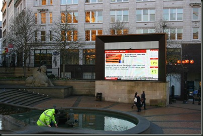
Actually, Birmingham city centre does have a nice selection of historic buildings (if not on the scale of some other cities). However, if there is a dominant style to the city centre, I would suggest that it is a rather apologetic postmodernism; a style that isn’t really modern, but rarely resembles any particular historic design either. This is well illustrated by the hand-carved sandstone plinth which supports a giant tv screen in Victoria Square, and the great variety of bespoke, cast iron bins and benches which “litter” the centre.
Birmingham pomo
Pomo-erotic
Victoria Square
Cast-iron benches in the renowned, Gothi-deco-steampunk style
More bespoke cast iron
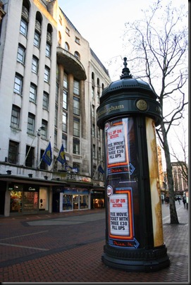
Elsewhere, advertising hoardings in plastic Victoriana stylee, sit next to dishevelled 20th Century buildings, chain shops selling sportswear and more giant tv advertising screens. You sense that the people who have shaped the recent development of the city centre, yearn for a history that Birmingham never actually had and has little to do with the realities of the city today. I suppose the last hurrah of postmodern era Birmingham is probably the blandly pleasant, corporate public realm of Brindley Place, topped by Demitri Porphyrios’ absurd campanile.
Brindley Place by Oosoom
As a pedestrian, Birmingham centre isn’t a particularly nice place to walk around. New Street, the main thoroughfare between the regenerated shopping Mecca’s of the Bullring and the Mailbox is particularly shabby. More widely, it’s often very confusing to find your way around, with little connection or commonality between developments. Navigating Birmingham can sometime feel like you are swimming against an overwhelming urban tide. Nowhere is this better illustrated then when trying to walk from the centre to the Jewellery Quarter, negotiating a precarious, pedestrian bridge, which is accessed through a series of ramps which project through the innards of an adjacent building, before crossing the concrete A38 canyon into the no-man’s land which leads to St Pauls Square. My colleague, Rob Rowlands, has a theory that recent planning in Birmingham has been about individual developments in isolation, rather than any sort of joined up strategy. I think the evidence to support this idea is all over Brum, whilst I also wonder if this is a hangover from the megaplans of the 60’s and 70’s, which are now held up as failures of planning.
Unlike London, where much of the urban infrastructure is hidden underground, in Birmingham it’s there for everyone to see, cutting through major thoroughfares with roads, carparks and other unsightly stuff (I’m going to avoid putting another postmodern metaphor in here). I seem to remember someone telling me, as an example of Birmingham’s entrepreneurial governance, that it was the first city to introduce pavement billboards. It still feels like Birmingham has more advertising, than any other UK city that I care to think of.
My favourite Birmingham carpark, located opposite Harvey Nichols and the Malmaison
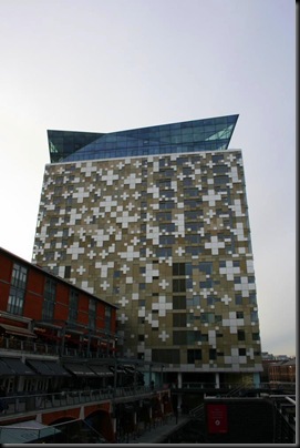
More recently a new Birmingham regeneration style has emerged with massive bombastic, look-at-me architectural logos. Examples of this new trend include, Make’s Cube, Beetham Tower, the new library, the Bullring and of course, Future Systerm’s Selfridges. Similarly, the proposed redevelopment of New Street Station, minds me of the sort of thing you see popping up in Abu Dhabi or Dubai. I suspect this is deliberate. You see, while I rather like Selfridges in particular, they all have a character that is entirely unrelated to Birmingham. They represent the physical embodiment of an effort to distance the city from what everybody thinks about it.
The Cube
Beetham Tower
The Bullring’s new Spiceal Street development
Selfridges
The proposed New Street Station redevelopment
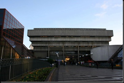
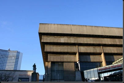
Which brings me to the library itself. I guess the first thing to say is that it’s actually pretty difficult to get a really good view of, which is surprising given that it’s bloody massive. Whilst it is a building of rare stature in the centre, from many important vistas, it is hidden behind the smoked-glass and plastic bland of the adjacent Copthorne Hotel.
Hiding behind the Town Hall
Peering out from behind…
…the gorgeous, Copthorne Hotel
The library revealed
I’m not going to try and dissect the architecture of the library, but I will say that it’s absolutely extraordinary. Local architect, John Madin, based the design on an inverted concrete ziggurat, or stepped pyramid, I think the scale and ambition of the building, demonstrate Madin’s love for the city; he wanted the absolute best for Birmingham. There really is nothing quite like it anywhere else in the world.
Which brings me to the second thing I really like about the library; Paradise Forum, the public arcade which runs through the heart of it. I just like the idea of building an amazing structure, and then letting everybody use it, however they want. Whilst the selection of amenities could be down-market, they are housed within an absolutely wonderful space, that is accessible to everyone and is well used by an incredibly broad range of people. It’s a genuinely inclusive public realm that is a world away from the sanitised spaces of Brindley Place, the Bullring and in all likelihood, the new library.
The lovely roof
Paradise Forum
I don’t think the new library will be a bad building, but I do think that it is quite an irony that it will be so close, both literally and in content, to the building it replaces. The design, by slightly wacky Dutch architects Mecanoo, is basically a great big box, prettified with some fancy metal attachments and gold cladding panels, which seem to be the latest architectural fad currently sweeping the nation. It’s interesting that for a city that appears a bit ashamed of its monumental concrete structures, is so quick is to respond with a new monumental concrete structure (albeit with some supposed European sophistication). If you thought the old library was ugly, then I’m not sure what you’ll make of the new one other than it being newer and cleaner.
The new library takes shape
The cladding in detail
Whilst taking these photos, I also took the opportunity to explore the bits of the library that I’d not really seen before – round the back and underneath it. It’s an interesting experience, kind of like seeing the remains of a future that never quite happened. The underground bits are also seriously dirty, badly maintained and run-down. However, nowhere is the relationship between the library and the city’s 1960’s concrete collar of roads, more apparent.
I guess there is a school of thinking that if you wipe away the buildings associated with this period in the city’s history, and when all the horrible stuff was built, then you will also get rid of the negative associations of the era. I don’t think it will, and worse I think it will destroy the evidence of what was actually a very important time and optimistic time for Birmingham.
Probably my favourite picture I took that day is from the back entrance to the library. It shows the poor state of repair, the numerous inappropriate architectural additions and a giant advertising billboard. It says so much about how Birmingham centre has been managed. There’s also a mock –Victorian signpost in there too.
It also struck me that the spaces at the periphery of the library, were reminiscent of London’s Barbican or maybe even the bits around the Sydney Opera House. In London and Sydney, these places are celebrated, whereas Birmingham’s most unique building is neglected, unloved and about to be knocked down. I’ve used the term, inferiority complex, in the title of this blog because it sums up Birmingham’s approach to regeneration. In a person this inferiority could be manifested by trying to be like someone else, rather than making the most of what’s good about yourself. I know this sounds a bit “self-help book”, but I really think this is Birmingham’s problem. I think it’s also worth pointing out that while I talk about this inferiority complex pretty generally, I think comes from the people in charge, and not necessarily the ordinary people of the Birmingham.
Anyway, I’ve said a lot about what I don’t like about Birmingham, so it’s probably about time I said what I do like, because actually I like Birmingham a lot.
Birmingham is a city of industrial and engineered heritage, and consequently it is characterised by robust materials: red bricks, blue engineering bricks and concrete – Victorian pubs, railway viaducts and Spaghetti Junction. It may not always be a pretty place, but the hilly topography offers complex, interesting vistas and visual juxtapositions. Nowhere is this more evident than Digbeth, which is also my favourite part of the city.
Digbeth viewed from Selfridges carpark
Digbeth is where the old and new of Birmingham meet, grow and go off in directions you don’t quite expect. Traditional metal-bashing factories sit side-by-side with new media and technology businesses, handsome Victorian pubs sit next to galleries and arts organisations, wildlife emerges from the ruins of industrial works and there is a growing community of independent people, shops and cafes. And it’s still all a bit of a mess.
A typical Dibeth view in all its glory
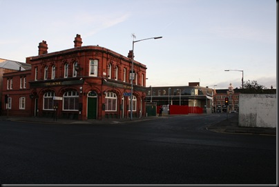
One of the areas many, handsome Victorian pubs
Grand Union Canal leading to Warwick Bar
Birmingham’s river, the River Rea
The Custard Factory
Looking at how Digbeth has grown from this industrial heritage, what I find so disappointing about the treatment of the library, is that it seeks to impose a new cultural identity on the city and wipe away a significant period of the city’s history. Not only is Birmingham Central Library a uniquely, striking building and an impressive feat of engineering, it is also the embodiment of the Birmingham’s 20th Century history.
By strange co-incidence I was actually writing this article, when I heard the sad news of architect John Madin’s death. Madin’s work showed a pride in Birmingham that I find lacking in more recent proposals for the city. I would like to think that in the wake of this news, we could have some re-evaluation of the plans to demolish the library. However, I think more realistic that it just serves as a reminder to appreciate this wonderful structure while it’s still here.














For someone who lived in Birmingham when the John Madin Central Library opened, this is a very interesting update on how the city has progressed.
ReplyDeleteRe the library, please check but my recollection is that the atrium was unglazed when it opened and that the central space was horrifically bleak, empty and windswept. I also have a sad memory of a fat tube 'sucking' the contents from the gothic revival Shakespeare Library when it was demolished.
After a long interval, I re-visited Birmingham in 2010 and was DAZZLED at how much it has been improved, more by urban landscape design than by architecture.
Thanks for your comments, Tom.
ReplyDeletehttp://en.wikipedia.org/wiki/Birmingham_Central_Library
Inevitably the information was on Wikipedia and you're absolutely right that the atrium wasn't glazed until relatively recently. Funnily enough, and I've evidently not articulated this, but I think the quality of public realm is often what makes the difference to whether buildings of this era are successful.
You also make an interesting point, that these buildings often were built in the wake of the wanton desctruction of our cities. There's an interesting question of whether this should influence how we view them today.
Jonathan,
ReplyDeleteA really interesting point you made about the relocation of Birmingham's centre. At BCU we teach a module speculating just that. We take the area loosely bounded by the old fire station, relocated council offices, new halls of residence at Aston and the children's hospital and extend it up the hill overlooking Digbeth, with Corporation street heading off to the right. Coming in from the north (via the A38), we get our students to imagine it as a gateway into the city, and as a place fit to house the civic headquarters of England's second city. We use the project to propose how the site might link the gun quarter, academic sites of Aston BCU at Gosta Green and the commercial and cultural areas of the established city centre. There's so much potential at this site which is currently dominated by traffic intersections. Perhaps you might like to come and see some of the work we do sometime? You can get in touch via Twitter.
Thank you Jonathan. My memory is coming into focus. I was working in Baskerville House, for the City Architects Department, and when the John Madin library first opened there was a deep muddy trench between the Hall of Memory and the Central Library. I crossed a scaffolding bridge on a rainy day. The wind was stronger beneath the ziggurat and, when I reached the 'plaza', there was a howling gale AND rain AND gloom AND no other humans. I did not see this as an example of good urban landscape design!
ReplyDelete