Stirling and Gowan’s Engineering Building at Leicester University has been a familiar presence in much of my life. As a child, my mother studied at the University and later worked in the library, and I have vivid memories of exploring the campus, riding on lifts and searching the library basement for dusty copies of L. Frank Baum’s books. As a teenager, I studied for my A Levels at the neighbouring Wyggeston & QEI College, and overlooked the building from both my biology labs, which faced onto the “egg box” bit and the design department, which looked onto the red-brick administrative block. It was only when I went on the study architecture at university in Sheffield, that I realised that the building that I had explored in lunch hours and quietly appreciated, was of significance to anyone but myself.

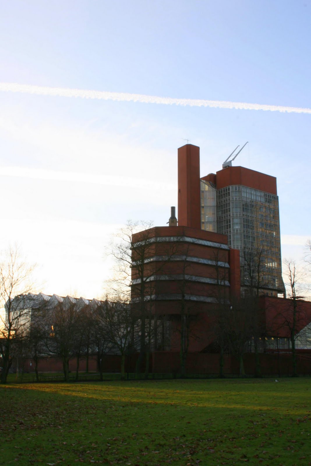
On a whim, I decided to take my camera and amble over to the Leicester University campus yesterday. Strolling across Victoria Park, I took a few snaps of Denys Lasdun’s Charles Wilson Building (see above, another favourite of mine), but struggled to get a decent shot of the Engineering Department (see my rather poor effort below).


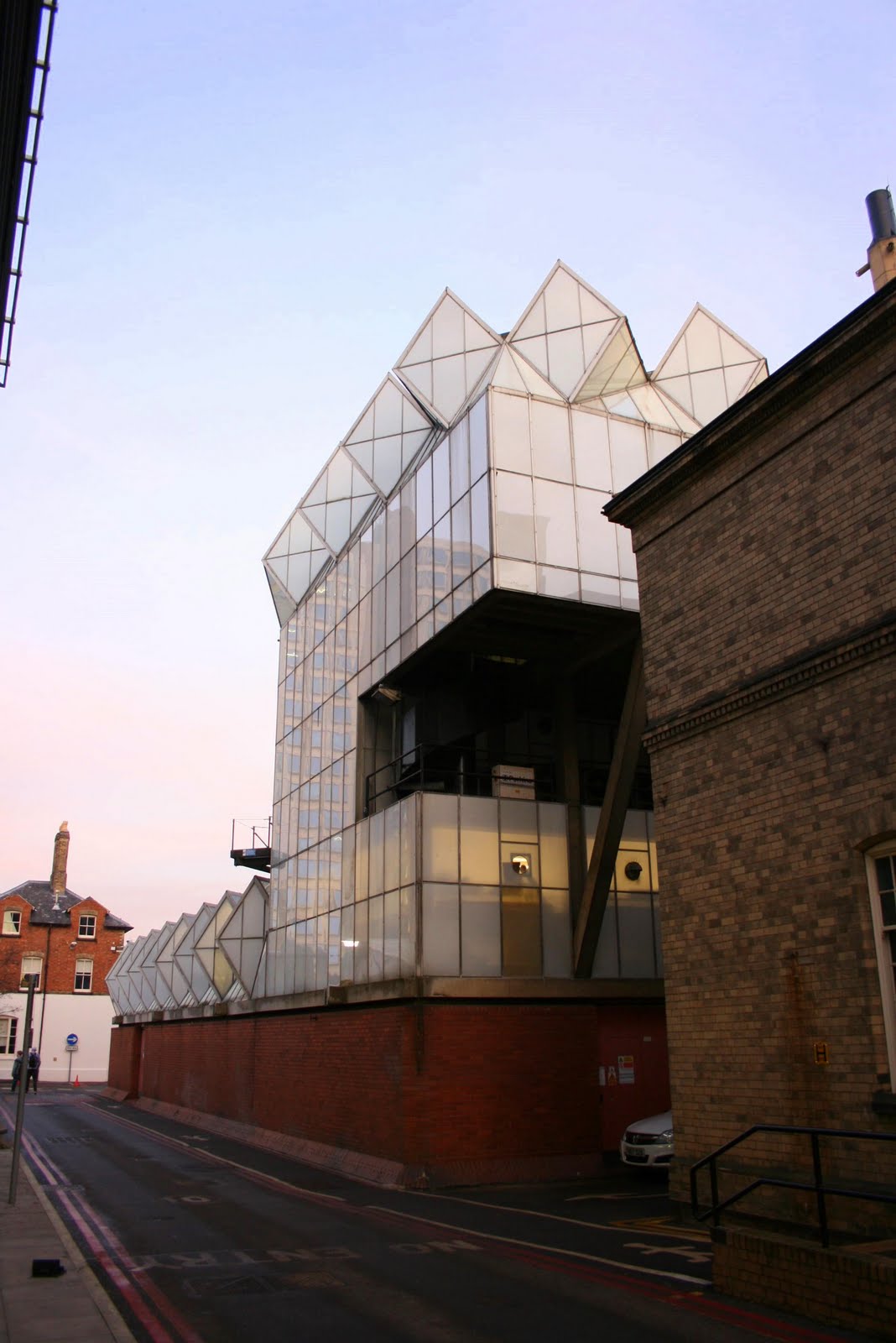
As I wander around the perimeter of the building, I’m struck initially by how dirty and poorly cared for it is. However, what quickly becomes clear is how difficult it is to get a decent view of it. Whilst partly a function of the buildings constrained site and close proximity to other buildings, you get the impression that some effort has actually been made to hide it – see the small trees that have been planted right next to it. If ever there was a building that needs to be explored and examined, it’s this one. Every view is different, and every look reveals new details and projections.


I have a theory, that our perceptions of buildings and built environment are highly influenced by the spaces and context from which we view them. When viewed from a hostile space, such as a busy road pavement, people are more likely dislike something. Conversely, buildings that can be observed in a more pleasant and contemplative environ, are far more likely to be positively received. In the case of Stirling and Gowan’s building, it is mostly viewed from a curtilage of car parks, bin stores and pre-fabricated plant sheds. I’m about to break the habit of a lifetime, but I really think that all the surrounding distractions need to be got rid of: bins, parking and in particular trees, they all need to go. It doesn’t need funky paving, granite balls or public art, it just needs some space.


There’s something of a metaphor for Leicester in here. Whenever I talk to people from Leicester about the Engineering building, they’re usually pretty negative about it. “I don’t really like it.” “It’s badly built.” “It’s falling apart.” “It’s impractical.” “It really ought to be knocked down.” Few people seem to appreciate the interesting things about Leicester, focusing rather on facilities that other provincial cities have. I suspect that the Council would see the back of many historic buildings, a semi-thriving market and every independent shop in the city, if it would get them a Pret a Manger or a Paul Smith. See also the Bowstring Bridge fiasco.


In my opinion, the best views are from the car park by the main building entrance. I generally try to avoid architectural gushing, but as I look up at the building (careful to avoid the bemused secretary reversing her Corsa), it seems to be improbably hanging above me. The strange projections seem to trick the eye; it just doesn’t look possible that the building should be able to support itself, but there it is, seemingly balanced on an all too-small base.


Steeling myself, I venture inside. Almost immediately, my plan to appear like I’m meant to be there, falls apart as I stare in confusion at the stairs. Is that a service stair? Are they doing rebuilding work? And then I get it, and start to climb the steps, sheepishly chuckling like someone who’s tried to drink the contents of a finger bowl at a Chinese restaurant. We’re meant to see all the services, how postmodern!


While I vaguely remember looking around the interior in the past, I’m still a little bit overwhelmed. If anything, the inside is even more quirky and complex than the outside. Compared to more modern buildings the lift and stair core, feels very cramped. Every floor seems to reveal new and interesting architectural incidents, some of which are slightly uncomfortable. I can’t think of the last time I felt waves of vertigo in a contemporary building!


Rather annoyingly, I can’t get really get any decent photo’s looking out, as the glass is too dirty. So I abandon my attempts to get to the top and head back down again. I feel disappointed that I’ve not taken some better pictures of the interior. In particular, a spectacular, glass roofed landing which marks the top of the the smaller half of the tower. It was occupied by group of earnest young men with beards, and not wanting to give myself away as an interloper, I resisted taking a photo. However on further reflection, I’m actually glad that I didn’t. I think the building needs to be experienced first hand, and that if you were to see too much before, it would spoil the experience.


As I trot down the final few flight of stairs, I try to sum up how I feel about the building. Words like ‘challenging’ cross my mind and then are quickly rejected. I’ve seen others describe buildings as ‘thrilling’, but never really understood this before. Lingering on one of the lower landings, I’m minded of something Will Self once said. He complained that modern air travel was too boring (yes I remember how he livened up one plane journey), and that in order to make it more exciting we needed daring pilots in winged helmets and glass bottomed planes. It seems to me that Stirling and Gowan’s building is very much like a glass bottomed aeroplane; for some it will be thrilling and exciting (myself included), whilst for others it is a rather strange experience.


As I exit the building, I’m once more depressed by the sheer crapness of this crucial arrival space. Cluttered with cars, traffic cones and brightly coloured road lines, it all points towards a building that is little loved and criminally, unappreciated. My suspicion is that it is being purposely run down in an attempt to make a case for future redevelopment (an article ran in Building Design in 2008, hinting at a partial demolition). I sincerely hope I’m wrong. I can appreciate that it is rather out of step with more modern university buildings, which are light, airy and immediate, but with a little more imagination, it could be a major feature for the University (and the City).


I do hope that my writing of this piques a few peoples interest. For anyone interested in British architecture of the 20th Century, I can only urge you to visit. It is a building that can only really be understood by experiencing it, rather than looking at it in pictures. I also suspect, that we probably won’t see it in its original form, for much longer.