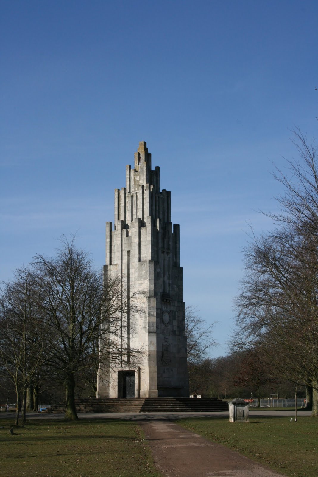
Quite aside from any work that I'm involved in, I think it's worth drawing to people's attention to. I'd guess that outside of Coventry (maybe even within Coventry), not many people will be familiar with either the Park or the Memorial. Built in 1927 and designed by local architect, T.F. Tinker, the Memorial comemorates the 2,587 local men who died during the First World War and is set in a mature parkland of sombre, copper beaches and formal gardens. The photo's below were taken on a bright, March morning as I popped down to take a few measurements. While I always enjoy spending time in the Park, I thought the Memorial looked particularly stunning in the harsh winter light. Standing 27m high, the Memorial is most obviously influenced by the deco style of the time, but it also has elements of more gothic architecture, with it's prominant, buttressed corners - in short it's a real one off. I have to confess to being fascinated by it, and would recommend that anyone with an architectural interest, check's it out. I hope my snaps do it justice.
Wednesday, 12 May 2010
War Memorial Park, Coventry
Quite aside from any work that I'm involved in, I think it's worth drawing to people's attention to. I'd guess that outside of Coventry (maybe even within Coventry), not many people will be familiar with either the Park or the Memorial. Built in 1927 and designed by local architect, T.F. Tinker, the Memorial comemorates the 2,587 local men who died during the First World War and is set in a mature parkland of sombre, copper beaches and formal gardens. The photo's below were taken on a bright, March morning as I popped down to take a few measurements. While I always enjoy spending time in the Park, I thought the Memorial looked particularly stunning in the harsh winter light. Standing 27m high, the Memorial is most obviously influenced by the deco style of the time, but it also has elements of more gothic architecture, with it's prominant, buttressed corners - in short it's a real one off. I have to confess to being fascinated by it, and would recommend that anyone with an architectural interest, check's it out. I hope my snaps do it justice.
Saturday, 19 December 2009
Shared Space update
See my previous post on Shared Space.
I was thus interested to see that the most recent isssue of the Landscape Journal had gone for a bit of shared space special. While I was pleased to see the topic being discussed, my feeling is that it's probably bit late as the tide seems to already have turned against the whole shared space concept. This view was rather confirmed by the recent article in Building Design entitled, "Is opposition to shared space kerbing councils' enthusiasm?". See below:
http://www.bdonline.co.uk/story.asp?sectioncode=426&storycode=3155013&c=1
From personal experience it feels like resistance has been steadily building to schemes which include elements of shared space. Whereas, a couple of years ago they'd have been positively received (such as North Arran Way - image above), recent proposals have been rejected early on in favour of traditional bitmac and kerbs. The reasons for this are, I believe, twofold; firstly I think that there is a natural inclination against doing anything new. This is particularly true of the risk driven world of the highway engineer, where the safety of new approaches needs to carefully considered, but also where the lazy officer can easily use safety as an excuse for carrying on with whatever makes their life easier (remember that shared spaces are always bespoke). The second reason is the work that Guide Dogs for the Blind has done to oppose shared spaces. While I'm still a little confused by why they've taken such a hard line on the matter, there's no question that they've done a very thorough job of tarnishing shared spaces in many peoples minds.
I was surprised by how very positive the experince was. While there was some initial opposition (particularly from a number of blind and partially sighted users, and the organisations that represented them), we were able to adapt the design then and there and include measures to address their very well considered concerns. These included the use of contrasting colours for street furniture and kerbs, introducing definable navigation routes for the visually empaired, as well as many, many other measures which made the scheme far richer than the one we started with. Everyone involved went away happy and I felt that I had designed something that would really benefit the community. With hindsight, I think it was this excercise, which made me realise how well shared space can work for everybody.
If the scheme sounds interesting, it's all on the internet. I've also dropped a link to one of the key plans below:
http://www.solihull.gov.uk/akssolihull/images/att14322.pdf
Ironically, kerbs were actually used throughout the scheme. The only place they were removed was at crossing points, in response to a request from users with limited mobility. I also suspect that had this scheme progressed in the current climate, I would have been met by users with placards, and we wouldn't have been able to have the positive debates that we did.
Guide Dogs for the Blind's opposition to shared space stems from the problems the removal of kerbs causes to blind and partially sighted users. Guide dogs are trained to recognise and stop at kerbs, whilst for many partially sighted users a kerb is visible marker of the road edge. Some people have also pounced on suggestion that pedestrians make eye contact with motorists (this actually dates back to Hans Monderman, but is in my opinion unnecessary - all you need is for the motorist to see you and understand that he doesn't have right of way). Guide Dogs for the Blind repeatedly make the point that blind and partially sighted people don't 'feel' included for by shared spaces schemes.
So is the removal kerbs a fundamental part of shared spaces? In my opinion yes and no. As it happens, I think the removal of all kerbs has been used too much on certain schemes. I would personally only remove kerbs altogether on very low trafficked areas, or areas where pedestrians enjoy a clear priority. However, if you are proscriptive about having to include conventional 80mm kerbs everywhere as some are suggesting (including our friends at Guide Dogs), then I think you lose what shared space is trying to achieve.
So in summary, why are shared spaces so important, and why am I so dismayed by it's detractors?
At it's heart, shared space isn't about kerbs of paving or even cars, it's about designing for people. By understanding how people behave in certain situations, we can use the built environment to positively influence their actions. Shared space is also about taking the priority for our streets back from cars - at the moment road design is all about turning circles and visibility splays, when it should be about the people that use them. What sort of people use the space and what are their needs? Where do people want to cross the road? Is the road a comfortable place for people?
It seems to me that there is a very real danger that the shared space 'furore', will serve only to maintain the status quo of cars first, people second. I sincerely hope I am proved wrong and that a satisfactory solution for is found.

Thursday, 10 December 2009
Castellated

cas·tel·lat·ed
(k
Tuesday, 18 August 2009
Blowing my own trumpet - On a Lagoon Garden
For some reason, I thought it would be fun to post some old images of my University work. I designed a garden based on Paul Klee's painting, "City on a Lagoon" and subsequently posted a few images up on a hastily put together website.
http://www.zap.to/landscape_architecure
It's all a little bit amateurish, but I should point out that the 3D renders were very cutting edge for 1997. Enjoy!

Tuesday, 26 May 2009
Port Marine, Bristol
Thus it was with some interest that I recently went back to visit the site. Sadly, I couldn’t specifically remember ‘my bits’, but I did have a general sense of déjà vu as I looked around. It’s all a bit of a pastiche, but quite a pleasant one and somewhat unsurprisingly it’s on the Prince’s Trust list of developments that Prince Charles likes.
As you can probably see, there’s a bit of a nautical theme to the area. If the buildings were people, they’d probably be wearing a blue and white stripey top, deck shoes and possibly a neck scarf or captains hat. Quite nicely done though.
Not a great photo this, but it does show one of the green ‘squares’ which are a bit of a feature of the development.
I think in principle, these areas work well. Where they are let down is by the maintenance, particularly in the soft and planted bits, which are looking tired and unkempt. Lot’s of Marshall’s Saxon paving and Conservation kerbs!
You could make the same observation again; while the overall design is interesting, the poor state of the grass detracts from the areas appearance.
Some of the more modern town houses in the scheme.
…and it all goes a bit Poundbury!
A bit of a theme developing here; nice quality housing, rather unkempt road frontage.
I know it’s a bit twee, but I still think this is a reasonably interesting streetscene (bar the big blocky extra floor emerging from the pitched roof on the right hand side). Pastel coloured building renders all look a bit ’west coast of Ireland’ to me.
The offending, big blue block! Front gardens work well in my opinion.
I actually rather like this mini square. It’s a nice scale for the houses around it and the flowering cherries give it a different feel from the surroundings.
Another of the development’s ‘squares’. Quite a nice one actually – I’ve a feeling I designed it!
Port Marines answer to Bath’s ‘Royal Crescent’ – a curve of buildings overlooking the central greenspace. More multi-coloured render.
The central greenspace. Looking generally underwhelming and uncared for. The grotty looking, blocks of concrete were once part of the old harbour in place of more conventional park benches. Nice idea, but all looks a bit random now.
Not really looking any better from this angle. I’m not quite sure what you’re meant to do in this space?!?
The centrepiece of the park, is this Gormley-esque sculpture. In spite of my myself, I actually quite like it. I’m told it was inspired by the five radio towers which used to be a feature of the area. This was the brochure image of the development, and seemed to be widely used as an example of public art.
From the front...
Finally, I thought I’d drop in this image of the big sculpture’s mini me, which is just round the corner. It’s obviously by the same artist, and hopefully gives you a little better idea of the construction. Not sure I like it really. I think that somewhere there must be some Government guidance on public art, which states that a certain percentage MUST be made of corten steel.
I think the overall result is generally pretty pleasant, if not entirely to my taste. Unfortunately the big let down is the maintenance of the public realm and greenspaces. You can’t blame the developer for this, as it is almost certainly down to the local authority that adopted it (and no doubt charged some fat commuted sums for doing so). Interestingly, we showed a client around here as an example for the redevelopment of Llanwern steelworks, and it convinced them to look at a community interest company (CIC) rather than LA adoption. See story here.
Monday, 18 May 2009
Eco-towns - PPS Response

Publicity image for the 'Pennbury' eco-town, Leicestershire
The Landscape Institute has recently published it’s response to the Government PPS on ‘Eco Towns’. As I had some comments on the subject, I’m quoted as an author of the report. I suspect the format of the response means that the LI has to come up with comments that fit particular statements. It kind of reminds me of the questionnaires that I had to fill in for the canteen when I lived in University Halls of Residence. They’d ask questions like “How would you rate the choice of vegetarian options?” or “How do you rate the variety of menu’s?”. When you really want to answer the questions, “How does the food taste?” - inevitably pretty vile, or “Is the food fit for human consumption?”- a simple no would suffice. Hence the PPS response deals with, ‘Are the locational principles for eco-towns sufficiently clear and workable?’, rather than the more straight forward, ‘Are the proposed eco-towns in good locations?’ Maybe this is the reason that I’m struggling to see much of my input! That said, I think the LI is right to push the whole ‘Green Infrastructure’ and ‘Place Making angle’, which seem to be gradually moving into the public conscienciousness. If you’re at all interested, I’ve put the press release and a link to the document below.
"8 May 2009
Landscape Institute verdict on Government's Planning Policy Statement for Ecotowns
The Landscape Institute has submitted its response to the Government's latest proposals for ecotowns. Over the past 6 months, a consultation has been underway on the content of the draft Planning Policy Statement for the new towns which sets out the standards that the developments are expected to achieve.
The Landscape Institute is particularly disappointed at the apparent failure of Government to grasp just how significant a role green infrastructure can play in meeting a wide range of standards to be achieved, ranging from water management to food production and biodiversity.
Another concern surrounds the lack of emphasis on the importance of place-making in the creation of ecotown communities. The Landscape Institute believes this is fundamental to the success of the ecotowns as places where people will want to live and where business will want to invest.
Read the full response here.
Find more information on the Government's ecotowns initiative here."