Friday, 12 November 2010

De Montfort University Business School, Leicester


I’m currently about half-way through Owen Hatherley’s excellent, “A guide to the new ruins of Great Britain.” At some point, I might write more about it, but given my recent lack of blog activity, it’s perhaps unlikely. The book picks up on a number of issues that have been nagging me about recent regeneration projects; fills them out, gives some historical perspective, adds some critical analysis, and then takes the piss.

As I read the book, it was schemes like the new, De Montfort University Business School, that sprang to mind. Owen describes how many recent buildings have much in common with the “Googie” architecture of 1950’s America; burger joints and giant advertising hoardings, designed to catch the eye of speeding motorists.


With it’s “look at me” turquoise cladding, jauntily angled towards the ring-road vista, this building definitely fits this description. Not wishing to linger too long on the architecture, I find the building slightly tacky and overbearing, particularly given it’s location in Leicester’s historic, Roman heart. While I don’t entirely dislike the plastic-Ikea styling, I resent the way it towers over the nearby Magazine, a solitary vestige of Leicester’s pre ring-road old town.


Naturally, I’m more interested in the landscape treatment and public realm design. Prior to visiting, I’d actually heard some positive comments about the scheme and the quality of finish. Unfortunately, I found it to be a jumbled mess of generic materials, that have little relationship with anything other than the new building. Dark granite pavers, light granite cobbles, buff bound gravel, polished stainless steel, black powder-coated steel, matt grey steel, grass, semi-mature trees, timber, rendered brick, concrete copings, granite blocks and pre-cast concrete, all scattered along a series of unrelated axis and geometries.


I would imagine that there was some sort of design statement which explained how the materials were inspired by the dirty sandstone of the magazine, unfortunately it would be empty post-rationalisation for the use of the same old materials palette and the simplest, polyline-from -the corner-of-the-building, design approach. Yes I’ve seen the same materials used elsewhere, by the same designers and on more than one occasion.

It’s funny, but I think there are clear parallels between recent public realm designs, with overly busy, multi-materialled treatments and much of the post-millennium architecture of Britain. I’m not sure if I’ve ever seen a provincial arts centre built in the last 5 years that didn’t feature a riot of cladding treatments. However, I’ve not seen anyone comment on how this fad has spread to the world of landscape architecture.


Returning to this particular scheme, I’m also irritated by the half-arsed detailing that is prevalent. Yes, it can be a bugger to get this stuff right, but all you need is someone who cares enough to see that service access’ doesn’t interrupt the design intent.


I REALLY hate the way, granite blocks meet a chamfered precast concrete block. Perhaps I’m being harsh on the designers involved and maybe this detailing is the result of some contractor led, design and build/value engineered approach. I really, really hope so.


Perhaps the most successful element of the scheme, is the area around the old Arts’ School building, leading up to the old Gateway College (yes I went there). The palette of materials seems much more restrained, with a formal lawn and some fine mature trees. However, I was a little dismayed that the treatment ends so abruptly before reaching the Gateway building.


Similarly, the paving doesn’t extend right up to the adjacent Newark House Museum (unsurprisingly the only bit of the area not part of the mighty, De Mont). In fact, for some reason we actually have a guard rail impeding access to this entrance?!?


Finally, the scheme also includes a ubiquitous, courtyard, come-amphitheatre, come performance space, complete with some tasteful planting. It’s quite pleasant.


Okay, okay, have I been too harsh on this scheme? In isolation, it's not so awful. I'm really trying hard not to be the blogging equivalent of Statler & Waldorf. Certainly, it’s much better than what used to be there, and I daresay that students will really use all that space to congregate, drop flyers and enjoy the odd hand rolled cigarette. The materials are at least of good quality, and for a certain sort of person, the scheme does give a certain veneer of urban sophistication. I just wish it was better.

Perhaps, given the inevitable quiet time ahead, it would be a good idea for us all to reflect and what actually makes a good public space and how successful the recent glut of schemes have actually been. Or maybe we should step away from ‘statement’ schemes, be they architecture or landscape architecture, and get back to improving the quality of our streets, homes and public amenities.

Thursday, 14 October 2010

Orpheus at Boughton House


It’s pretty infrequent that a landscape scheme receives recognition beyond the professional press, but Kim Wilkie’s “Orpheus” at Boughton House, did just this. Opened in September 2009 to an assembly of the great and the good, “Orpheus” is a contemporary landscape feature, designed to complement the restoration of the surrounding historic parkland. The scheme was warmly received by many in the national press, including:

Mary Keen in the Telegraph

Anna Pavord in the Independent

I have to confess to being a bit of a sucker for big earthwork features (in fact I’d go as far as to say that no landscape architect’s coffee table is complete without a copy Charles Jencks’ “Garden of Cosmic Speculation”), so would thoroughly recommend that you check out some of the beautiful pictures taken of the scheme:

http://www.kimwilkie.com/pages/projects/uk/uk_bghtpk.html

http://www.boughtonhouse.org.uk/htm/restoration/orpheus.htm

Unfortunately, my photo’s are pretty pants by comparison. Visiting times are rather limited (the house is still in the private ownership of the Buccleauch family), so it almost a year before I was able to arrange a visit on behalf of the Landscape Institute, and by this time summer had well and truly broken. So apologies for the lameness of the accompanying images.

Before looking at Orpheus itself, I think it’s worth setting the scene about Boughton House and the wider parkland. For those that are interested, I’ve put images of the wider park in a separate Castellated blog post.

http://castellated-uk.blogspot.com/2010/10/boughton-house-northamptonshire.html

The original landscape was laid out in the 17th Century, in a series of geometric canals surrounding a larger “Grand Etang”, inspired by the baroque styles of France and Versailles. In the years after this, the Montagu family (owners of the house) found themselves doing rather well and as a result, Boughton was passed on to a minor family member. Consequently, the house wasn’t given a Capability Brown, “naturalistic” makeover, that was common in the 18th Century.


Following many years of neglect, restoration of the original landscape began in the 1970’s and Orpheus is the culmination of this work.

On the face of it, Boughton House is very like your typical National Trust stately home, but the formality and geometry of the surrounding landscape gives it a very different feel. I’ve seen it described on more than one occasion as the English Versailles; while I see where this is coming from, I think you’ll be disappointed if you ever have been to Versailles, as Boughton is on a much, much smaller scale. But it’s definitely worth a visit, and I was pleasantly surprised by the quality of Boughton’s new gardens.


Anyway...


Orpheus is a very big hole in the ground. More accurately, it is a 7m inverted pyramid, with descending terraces that lead to a dark, square pool. Inspired by the Greek myth of Orpheus’ journey into the underworld to rescue Eurydice, the “hole” is a companion piece to the nearby ‘Mount’, a key feature of the original historic landscape. Whilst a very simple idea, there’s no question the “hole” makes for an interesting and unusual space, being so detached from the surrounding landscape. While the term ‘outdoor room’ is hideously overused, the space can only be described as an ‘outdoor room’. I gather that James Turrel’s Skyspaces were an inspiration, and I found Orpheus a similar experience. For the pseuds amongst you (myself included), it’s a great place to think grand thoughts and imagine all sorts of deep meanings!


Despite the great size of said ‘hole’, it is almost imperceptible in it’s surroundings. (see below) I think it’s discovery could be an interesting surprise, if you hadn’t been pre-warned of it’s existence...


You’ll also notice that there’s a steel framed cube and some curvy stone rills, which apparently relate to the Finobacci sequence, and have like, something to do with the dimensions for the, like hole and stuff. I’ll be honest that this bit didn’t really do anything for me. Worse it reminded of a bunch of schools I’ve worked on, where similar sorts of whirly patterns were included to tick a box for outdoor maths. I suppose that they do give the feature some tangible presence in the landscape, which is perhaps the best you can say for this part of the feature.


As a final point, I think it’s worth highlighting the quality of workmanship and finish, which is quite outstanding. While I do wonder how well the scheme would stand up to the hoards of visitors you regularly see at National Trust properties, I think everyone involved with the scheme should be applauded. To me, it demonstrates that it’s entirely possible to do something new and imaginative, whilst also preserving historic places and features. I look forward to the next phase of restoration at Boughton House.


Friday, 10 September 2010

Free Schools, Unnecessary Design and Aesthetics

My eye was caught this morning by an article in Building Design which quoted renowned education expert, Toby Young, (I believe his “How to lose friends and alienate people” is a standard textbook for all PGCE students) as saying that “design is not necessary.”

http://www.bdonline.co.uk/news/free-school-pioneer-says-design-not-necessary/5005341.article

While I appreciate that the piece is written in a pretty provocative way (and that the headline didn’t appear to be a direct quote), I found the general gist made me feel profoundly depressed, although initially I wasn’t really able to really articulate why.

Following a frenzied morning of tweeting (thank you, @NemesisRepublic), I think I’ve figured it out.

The last couple of years have been a very tough time for designers across the board, with fee’s being squeezed again and again. As an example my former boss, Don Munro, used to get us to put a time into fee proposals for ‘designing’. This would be the time when we sketched, thought of ideas and just considered the site and project. Increasingly clients started to challenge this. I think this was best summed up by client who said , “I don’t want you to design, I just wasn’t you to draw it up.” As far as I know, Don no longer puts time for ‘designing’ into his fee proposals (but he still designing).

I think this trend has been reflected in much of what has been designed and built recently. Landscape Architecture companies have won work with incredibly low fees, which are only possible by rehashing schemes that they’ve done before – same surfacing, same planting, same furniture, same details and often starling similar arrangements (I’m particularly thinking of some recent public realm schemes). The results are generally mind-numbingly bland and uninteresting. I’m afraid this type of approach is like kryptonite to me. Without wishing to sound like Prince Charles, it’s my fundamental belief that all site design should begin with consideration of context.

Perhaps I’m just being paranoid, but I get the sneaking feeling that there are people in power who do see money spent on professional design advice as unnecessary (yes Michael Gove, I’m thinking of you), and that it can be eliminated. But I think it’s also fair to say that the public perception of designers, and architects in particular, isn’t that great.

I think the problem is that design has become confused with aesthetics in the public consciousness. Like fashion – expensive and frivolous.

But design is also about functionality (for most designers of the built environment I’d say much more so). Time thinking about design, is not just time given to making things look pretty. It’s thinking about how a design will be used – is that space big enough, is that material suitable for this location and how will it be used in the future?

I guess my concern will be that instead of employing architects and landscape architects, there are those who think you can just send some volunteers on a course about how to design stuff, meaning less work for the likes of me. Isn’t this what the Big Society is about?!?

Or maybe I’m being overly concerned. It could be that when the likes of Toby Young say that “design is unnecessary”, what he really means is that they don’t want designs that are too fancy, but that he lacks the understanding of the subject to properly articulate this. Perhaps he could do with some professional advice?

Tuesday, 7 September 2010

Antony Gormley: 6 Times


In the far mists of time when I was studying for my art GSCE, a friend and classmate called Jude, made an amazing discovery. Following a suggestion from his Sister, Jude stuck cut-out newspaper headlines (stuff about war and pollution and Africa), around his slightly dodgy, 2B pencil and poster-paint representations of cow bones . What he hadn’t expected was the rapturous response he received from our Art Teacher, Mrs. Warwick, who thought this was the greatest artistical innovation, since middle-class Westerners discovered batik.

Following this success, Jude prepared an artist study, with of a painting of a desert and some droopy clocks(inspired by Salvador Dali), surrounded by newspaper headlines about scandal. He then went on to produce his major project, which featured a gouache seabed, with pencilled fish bones and aquatic skeletons, surrounded by headlines about, oh, oil being bad or something. For his piece de resistance, Jude’s final art exam... actually I can’t remember, but I’m dam sure it had bones and newspaper headlines.

I give this story, because it seems to me that Antony Gormley has followed a similar career path in the grown-up world of art, as my mate Jude did at Judgemeadow Community College. Only instead of bones and newspaper headlines, Gormley has figures. Also like Jude, Gormley seems to enjoy most success, when he sticks most closely to this formula (i.e. figures on Crosby Sands = good, random plinth in Trafalgar Square=bad).

While it may appear that I’m being snide about Antony Gormley’s work, it is with some affection. For me he’s like the Abba of the sculpture world; you know it’s cheesy, but you can’t help liking the Angel of the North (or SOS).

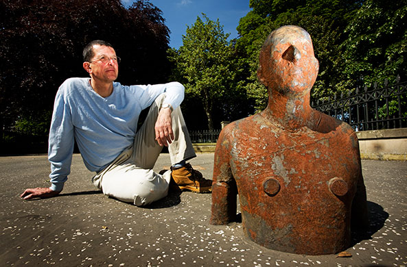
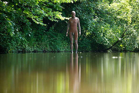
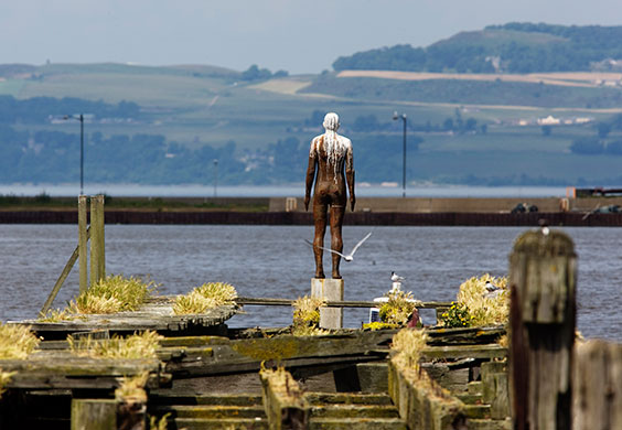
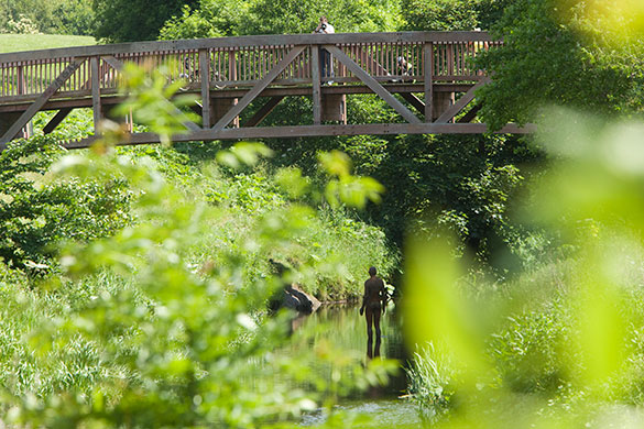
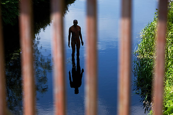
Hence I thought I’d share some recent Guardian photographs of ‘6 times’, Gormley’s new installation of 6 figures leading from the Scottish National Gallery of Modern Art to Edinburgh’s Leith Docks.


Friday, 13 August 2010

Carbuncle Cup 2010 - a landscape architects view


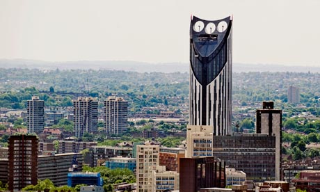
It was announced yesterday, that Strata Tower at Elephant & Castle was the winner of the 2010 Carbuncle Cup; Building Designs annual award for Britain’s ugliest new building.

http://www.bdonline.co.uk/news/strata-tower-wins-2010-carbuncle-cup/5004110.article

As is often the way these days, I picked up the news from Twitter on my phone. Other items that I found myself prodding my way through included: various wacky Government ideas for saving loot/letting communities build stuff, and an article about the ‘awful’ plans of Rowan Atkinson to knockdown his old 1930’s property and replace it with a new, modern design. Scanning through the articles I began to feel a certain sense of unease...

http://blogs.telegraph.co.uk/culture/harrymount/100045027/rowan-atkinsons-dream-home-is-a-nightmare/


Reading through the comments left by readers, what struck me most was the uniform negative views about new development and modern architecture, but also how this resonated with the write up of the Carbuncle Cup decision. It seems to me that any public debate on new architecture is usually pretty unsophisticated. I’d suggest there are basically two architectural news stories (and the Rowan Atkinson article had both of them): 1. Old building has or is going to be knocked down – bad. 2. New building is being proposed or has been built – also bad.

I’m a frankly a little surprised by my concern for the well being of architects. When the Carbuncle Cup first appeared, I thought it was a genius idea. I think landscape architects are a bit like architect’s dowdier friend (the shy one with big, milkbottle glasses and fuzzy hair) ; they spend a lot of time together but LA’s rarely get the same attention and have to make do with the boys/land/budget left over by their more showy friends. So the Carbuncle Cup is a rare opportunity to get one back.

OK, so the Strata Tower is very big and very visible. It’s also garish, ostentatious, far too “look at me” and has all the sophistication of a zebra-print sofa. However, as others have pointed out, the decision to build such a big and vulgar building is made by many people and not just the architects. Hence, I have a degree of sympathy for the architects who have been singled out here. But it also seems to me that the significance of BD’s decision goes a bit deeper. Strata Tower is statement architecture. The thinking being that such an architectural statement will assist the regeneration and economic renewal of the area. By ridiculing this building, will it not discourage other developers from paying out for expensive architectural centrepieces? Is this not biting the hand that feeds architecture? And isn’t it giving further ammunition to those who oppose new or modern buildings?

Again, I’d reiterate that maybe this isn’t such a bad thing for landscape architecture and me personally. Perhaps someone will decide that a more cost effective way to regenerate an area would be to develop a really nice park, which I’d certainly approve of.


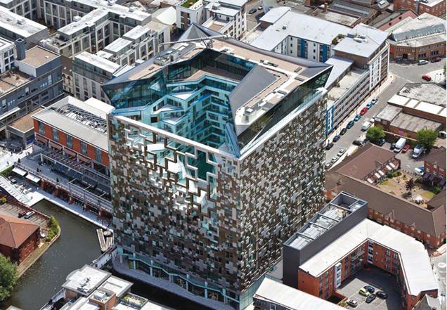
Of the other building’s on the shortlist, MAKE’s Cube thing, certainly stand's out as pretty hideously gauche. While it definitely deserves derision, the cream of the crap has got to be the Burns Monument Centre...


I’ve posted above a picture of the grandiose, original monument which was sadly damaged in a fire. Below is the new bicycle shed-type arrangement, designed by the local authority to “restore” the monument. It’s so crude and frankly such a laughably mundane use of a particularly flamboyant, historic folly, that I actually don’t know where to start. It’s just wrong.

However, I really think it needs to be seen in context of what was there before, because in a weird way, I suspect it’s utlilitarian, traditional materialled, non-design would not be considered offensive to many members of the general public. Probably less so than more modern styles.


Given the current political climate, with talk of schools in re-used industrial buildings and community led housing initiatives, I think the real threat to architecture is not wanky, ego-driven mega-developments, but buildings that don’t require architects at all.

It’s not for me to say how the architectural profession should present itself in public and maybe my points are irrelevant to the organisers of the Carbuncle Cup. As it happens I’m quite pleased that bad developments are being shown up (I’ve got one or two buildings in mind for nominating next year), but as an interested outsider, I can’t help but think that the coverage of the Carbuncle Cup probably isn’t doing the profession any real favours.

Friday, 6 August 2010

Jubilee Campus, Juxtapositions and Plonk-architecture


A couple of weeks ago, the East Midlands Branch of the Landscape Institute held their AGM at Nottingham University’s Jubilee Campus. Prior to the main event, where everyone tries to avoid being voted onto the committee (I must have lost again, as I’m still Branch Secretary), we had tour of the Campus itself.

WARNING! The following Blog post contains graphic images of Landscape Architects.


While I’d passed by the campus a few times, and seen plenty of pictures in the architectural press coverage (much of which was highly critical), I was very keen to see it for myself. Contrary to many, I actually thought that the new buildings looked pretty cool.


What I hadn’t really remembered, is that the buildings by MAKE Architects are only a recent addition to the site. The original campus masterplan was produced by Michael Hopkins and Partners, who also designed the first phase of buildings, and opened in 1999. The scheme is based upon sustainable principles and was developed on a brown field site (the former Raleigh bicycle factory). The Djanogly LRC , with it’s single spiralling floor, is the most recognisable building here (and where I took a few rooftop snaps). However, the real focus of the scheme is on the artificial lakes which run through the heart of the campus.


The green credentials are also pretty impressive ; the lakes are used as a giant heatsink, whilst everywhere you look there are ventilation chimneys, swales, photovoltaic cells and green roofs.


Actually, I’m a little unsure about the green roofs – the planting reminds me of the sort of thing you see sprouting from a disused runway.


Ambling along the waterside concourse is a very pleasant thing to do on a sunny, summer evening. Looking over the water to the backdrop of reeds, trees and wildlife – you could almost forget you’re in Nottingham! Whilst timber cladding has become rather passé, the palette of materials used is simple, well balanced and tasteful. You would feel proud to be a student here.


It’s actually some way into the campus before I get my first glimpse of MAKE’s phase 2 buildings, and then rather strangely half hidden behind a building and some car parking. The new buildings are certainly striking.


As you continue south, a new pathway leading to the phase 2 campus, cuts across the main concourse. Where the Hopkins designed campus is all calm and simplicity, this new path is a riot of colours, funky paving, water-features, stone cubes, trees and brightly coloured planting. Someone with a more base mind than I, could draw some sort of significance from the way this path ends in a fountain on the otherwise tranquil lake...


Look it's "Aspire" (it’s a pun, it’s an inspiration, it’s a metaphor, it’s a giant ice cream cone).


Wandering round the campus, I had found myself defending MAKE’s buildings to a former colleague, who was convinced that they represented the worst excesses of “starchitects”. I cited Laver’s Law, that Universities should be about new, and optimistic, and finally that they are just ahead of their time. But as I get closer, I begin to doubt my arguments.


Close up and I can begin to understand why I want to like these buildings. Part of me is still the small child that grew up watching sci-fi films and is desperately disappointed by the modern world. Where are the flying cars? Where are the discos with uninhibited space chicks dancing in silver mini-skirts? And where is the lunar colony? MAKE’s buildings are a business park approximation of how I imagined 2010 should look and kind of wish it did. Unfortunately, for all their sci-fi styling, there are some seriously big problems with these buildings. For a start...


... they face straight onto a car park and the arse-end of other buildings (again I can imagine some might to want to use a crude metaphor for this. Not I, natch). Landscape architecture is all about context and setting, whereas these buildings give no regard to their setting and only seem to interact with what immediately surrounds them (notice how the planting is limited to just the building curtilage). When our guide “explained” the thinking behind MAKE’s design I could actually feel myself getting angry. Apparently, the coloured bands represent the underlying strata, planting is inspired by American studies, whilst the east-west axis extends the site... Rubbish. It’s just empty post rationalisation for doing whatever the hell they like.


Plonk architecture isn’t just confined to this scheme. Was the Gherkin designed especially for Swiss Re, or had it been sitting on Ken Shuttleworth’s (Mr MAKE) drawing board, just waiting for an somewhere to stick it? While architecture can create a new character for a place, I think a design is nearly always more successful when it gives some regard to it’s context and setting. Unfortunately, it seems to me that too many designers, driven by their ego, set out to create their own context. Worse still, I think that there is actually a school of thinking in architecture particularly, that wants to actively go against, subvert or contrast with it’s surroundings, because “Hey, it’s a juxtaposition!”


The Hopkins masterplan gives the campus a clear, simple layout and a calm, elegant environ, which MAKE completely disregard .While I want to love MAKE’s addition to the Jubilee campus for it’s futuristic style, it’s contempt for the surrounding context is everything I detest in the design of our built environment. Some may argue that taken out of context these buildings are terrific, but context is everything when dealing with the world we live in.


Weirdly though, as we trudged back to the car park, I found myself wishing that more buildings were shaped like aerodynamic wedges and clad in exotic metails. A few space chicks in mini skirts wouldn’t go amiss either.