Thursday, 2 December 2010

Yorkshire Sculpture Park #1


I’ve been a little worried that my blog is rather dominated by me complaining about stuff I don’t like. So it’s nice to be able to write a blog post about something I thoroughly approve of. When I heard news of Yorkshire Sculpture Park being expanded, I thought it was worthy of a blog post (or 4):

http://www.ysp.co.uk/ysp-media/press-releases/yorkshire-sculpture-park-launches-ambitious-new-landscape-restoration-project

Yorkshire Sculpture Park (or YSP as it tends to style itself) is a contemporary sculpture park, set in over 500 acres of former parkland, close to Wakefield. It contains a mixture of permanent installations and seasonal exhibits, which are a ‘who’s who’s’ of modern sculpture. It’s a fascinating place that even seems to appeal to those who claim not to understand art! It’s so big and there’s so much of everything to see, that every visit seems to lead to explorations of new and undiscovered places. Bretton Hall, which sits in the middle of the park, is a crumbling pile that was once used as a teaching college, and is now being converted into a hotel. In addition to the art works, the grounds are littered with features and follies, once associated with the Hall. The grounds also contain a number of abandoned 70’s education buildings, which themselves make for interesting, but slightly surreal experiences as you make your way through the park.

The recent visitor centre and galleries, are all rather lovely and I can thoroughly recommend the restaurant. Best of all, it’s entirely free to get in, and there’s only a small charge for parking.

From a purely selfish perspective, I’d honestly prefer it people didn’t want to go there. I’ve been many times over the years, and even on an August Bank Holliday, the park has been blissfully quiet. However, it’s such a terrific place that I can only wish it every success.

Rather than overload my blog with hundreds of my pictures, I’ve decided to split my slightly random pictures over 4 posts. This one focussing on the visitor centre and Henry Moores, with a little bit of Andy Goldsworthy thrown in for good measure.


Friday, 12 November 2010

De Montfort University Business School, Leicester


I’m currently about half-way through Owen Hatherley’s excellent, “A guide to the new ruins of Great Britain.” At some point, I might write more about it, but given my recent lack of blog activity, it’s perhaps unlikely. The book picks up on a number of issues that have been nagging me about recent regeneration projects; fills them out, gives some historical perspective, adds some critical analysis, and then takes the piss.

As I read the book, it was schemes like the new, De Montfort University Business School, that sprang to mind. Owen describes how many recent buildings have much in common with the “Googie” architecture of 1950’s America; burger joints and giant advertising hoardings, designed to catch the eye of speeding motorists.


With it’s “look at me” turquoise cladding, jauntily angled towards the ring-road vista, this building definitely fits this description. Not wishing to linger too long on the architecture, I find the building slightly tacky and overbearing, particularly given it’s location in Leicester’s historic, Roman heart. While I don’t entirely dislike the plastic-Ikea styling, I resent the way it towers over the nearby Magazine, a solitary vestige of Leicester’s pre ring-road old town.


Naturally, I’m more interested in the landscape treatment and public realm design. Prior to visiting, I’d actually heard some positive comments about the scheme and the quality of finish. Unfortunately, I found it to be a jumbled mess of generic materials, that have little relationship with anything other than the new building. Dark granite pavers, light granite cobbles, buff bound gravel, polished stainless steel, black powder-coated steel, matt grey steel, grass, semi-mature trees, timber, rendered brick, concrete copings, granite blocks and pre-cast concrete, all scattered along a series of unrelated axis and geometries.


I would imagine that there was some sort of design statement which explained how the materials were inspired by the dirty sandstone of the magazine, unfortunately it would be empty post-rationalisation for the use of the same old materials palette and the simplest, polyline-from -the corner-of-the-building, design approach. Yes I’ve seen the same materials used elsewhere, by the same designers and on more than one occasion.

It’s funny, but I think there are clear parallels between recent public realm designs, with overly busy, multi-materialled treatments and much of the post-millennium architecture of Britain. I’m not sure if I’ve ever seen a provincial arts centre built in the last 5 years that didn’t feature a riot of cladding treatments. However, I’ve not seen anyone comment on how this fad has spread to the world of landscape architecture.


Returning to this particular scheme, I’m also irritated by the half-arsed detailing that is prevalent. Yes, it can be a bugger to get this stuff right, but all you need is someone who cares enough to see that service access’ doesn’t interrupt the design intent.


I REALLY hate the way, granite blocks meet a chamfered precast concrete block. Perhaps I’m being harsh on the designers involved and maybe this detailing is the result of some contractor led, design and build/value engineered approach. I really, really hope so.


Perhaps the most successful element of the scheme, is the area around the old Arts’ School building, leading up to the old Gateway College (yes I went there). The palette of materials seems much more restrained, with a formal lawn and some fine mature trees. However, I was a little dismayed that the treatment ends so abruptly before reaching the Gateway building.


Similarly, the paving doesn’t extend right up to the adjacent Newark House Museum (unsurprisingly the only bit of the area not part of the mighty, De Mont). In fact, for some reason we actually have a guard rail impeding access to this entrance?!?


Finally, the scheme also includes a ubiquitous, courtyard, come-amphitheatre, come performance space, complete with some tasteful planting. It’s quite pleasant.


Okay, okay, have I been too harsh on this scheme? In isolation, it's not so awful. I'm really trying hard not to be the blogging equivalent of Statler & Waldorf. Certainly, it’s much better than what used to be there, and I daresay that students will really use all that space to congregate, drop flyers and enjoy the odd hand rolled cigarette. The materials are at least of good quality, and for a certain sort of person, the scheme does give a certain veneer of urban sophistication. I just wish it was better.

Perhaps, given the inevitable quiet time ahead, it would be a good idea for us all to reflect and what actually makes a good public space and how successful the recent glut of schemes have actually been. Or maybe we should step away from ‘statement’ schemes, be they architecture or landscape architecture, and get back to improving the quality of our streets, homes and public amenities.

Thursday, 14 October 2010

Orpheus at Boughton House


It’s pretty infrequent that a landscape scheme receives recognition beyond the professional press, but Kim Wilkie’s “Orpheus” at Boughton House, did just this. Opened in September 2009 to an assembly of the great and the good, “Orpheus” is a contemporary landscape feature, designed to complement the restoration of the surrounding historic parkland. The scheme was warmly received by many in the national press, including:

Mary Keen in the Telegraph

Anna Pavord in the Independent

I have to confess to being a bit of a sucker for big earthwork features (in fact I’d go as far as to say that no landscape architect’s coffee table is complete without a copy Charles Jencks’ “Garden of Cosmic Speculation”), so would thoroughly recommend that you check out some of the beautiful pictures taken of the scheme:

http://www.kimwilkie.com/pages/projects/uk/uk_bghtpk.html

http://www.boughtonhouse.org.uk/htm/restoration/orpheus.htm

Unfortunately, my photo’s are pretty pants by comparison. Visiting times are rather limited (the house is still in the private ownership of the Buccleauch family), so it almost a year before I was able to arrange a visit on behalf of the Landscape Institute, and by this time summer had well and truly broken. So apologies for the lameness of the accompanying images.

Before looking at Orpheus itself, I think it’s worth setting the scene about Boughton House and the wider parkland. For those that are interested, I’ve put images of the wider park in a separate Castellated blog post.

http://castellated-uk.blogspot.com/2010/10/boughton-house-northamptonshire.html

The original landscape was laid out in the 17th Century, in a series of geometric canals surrounding a larger “Grand Etang”, inspired by the baroque styles of France and Versailles. In the years after this, the Montagu family (owners of the house) found themselves doing rather well and as a result, Boughton was passed on to a minor family member. Consequently, the house wasn’t given a Capability Brown, “naturalistic” makeover, that was common in the 18th Century.


Following many years of neglect, restoration of the original landscape began in the 1970’s and Orpheus is the culmination of this work.

On the face of it, Boughton House is very like your typical National Trust stately home, but the formality and geometry of the surrounding landscape gives it a very different feel. I’ve seen it described on more than one occasion as the English Versailles; while I see where this is coming from, I think you’ll be disappointed if you ever have been to Versailles, as Boughton is on a much, much smaller scale. But it’s definitely worth a visit, and I was pleasantly surprised by the quality of Boughton’s new gardens.


Anyway...


Orpheus is a very big hole in the ground. More accurately, it is a 7m inverted pyramid, with descending terraces that lead to a dark, square pool. Inspired by the Greek myth of Orpheus’ journey into the underworld to rescue Eurydice, the “hole” is a companion piece to the nearby ‘Mount’, a key feature of the original historic landscape. Whilst a very simple idea, there’s no question the “hole” makes for an interesting and unusual space, being so detached from the surrounding landscape. While the term ‘outdoor room’ is hideously overused, the space can only be described as an ‘outdoor room’. I gather that James Turrel’s Skyspaces were an inspiration, and I found Orpheus a similar experience. For the pseuds amongst you (myself included), it’s a great place to think grand thoughts and imagine all sorts of deep meanings!


Despite the great size of said ‘hole’, it is almost imperceptible in it’s surroundings. (see below) I think it’s discovery could be an interesting surprise, if you hadn’t been pre-warned of it’s existence...


You’ll also notice that there’s a steel framed cube and some curvy stone rills, which apparently relate to the Finobacci sequence, and have like, something to do with the dimensions for the, like hole and stuff. I’ll be honest that this bit didn’t really do anything for me. Worse it reminded of a bunch of schools I’ve worked on, where similar sorts of whirly patterns were included to tick a box for outdoor maths. I suppose that they do give the feature some tangible presence in the landscape, which is perhaps the best you can say for this part of the feature.
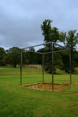


As a final point, I think it’s worth highlighting the quality of workmanship and finish, which is quite outstanding. While I do wonder how well the scheme would stand up to the hoards of visitors you regularly see at National Trust properties, I think everyone involved with the scheme should be applauded. To me, it demonstrates that it’s entirely possible to do something new and imaginative, whilst also preserving historic places and features. I look forward to the next phase of restoration at Boughton House.