Friday, 13 August 2010

Carbuncle Cup 2010 - a landscape architects view


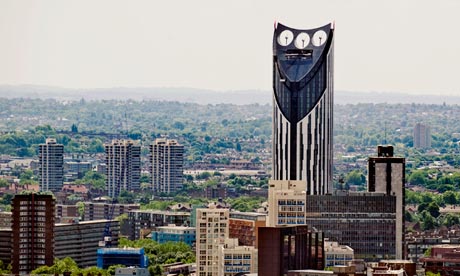
It was announced yesterday, that Strata Tower at Elephant & Castle was the winner of the 2010 Carbuncle Cup; Building Designs annual award for Britain’s ugliest new building.

http://www.bdonline.co.uk/news/strata-tower-wins-2010-carbuncle-cup/5004110.article

As is often the way these days, I picked up the news from Twitter on my phone. Other items that I found myself prodding my way through included: various wacky Government ideas for saving loot/letting communities build stuff, and an article about the ‘awful’ plans of Rowan Atkinson to knockdown his old 1930’s property and replace it with a new, modern design. Scanning through the articles I began to feel a certain sense of unease...

http://blogs.telegraph.co.uk/culture/harrymount/100045027/rowan-atkinsons-dream-home-is-a-nightmare/


Reading through the comments left by readers, what struck me most was the uniform negative views about new development and modern architecture, but also how this resonated with the write up of the Carbuncle Cup decision. It seems to me that any public debate on new architecture is usually pretty unsophisticated. I’d suggest there are basically two architectural news stories (and the Rowan Atkinson article had both of them): 1. Old building has or is going to be knocked down – bad. 2. New building is being proposed or has been built – also bad.

I’m a frankly a little surprised by my concern for the well being of architects. When the Carbuncle Cup first appeared, I thought it was a genius idea. I think landscape architects are a bit like architect’s dowdier friend (the shy one with big, milkbottle glasses and fuzzy hair) ; they spend a lot of time together but LA’s rarely get the same attention and have to make do with the boys/land/budget left over by their more showy friends. So the Carbuncle Cup is a rare opportunity to get one back.

OK, so the Strata Tower is very big and very visible. It’s also garish, ostentatious, far too “look at me” and has all the sophistication of a zebra-print sofa. However, as others have pointed out, the decision to build such a big and vulgar building is made by many people and not just the architects. Hence, I have a degree of sympathy for the architects who have been singled out here. But it also seems to me that the significance of BD’s decision goes a bit deeper. Strata Tower is statement architecture. The thinking being that such an architectural statement will assist the regeneration and economic renewal of the area. By ridiculing this building, will it not discourage other developers from paying out for expensive architectural centrepieces? Is this not biting the hand that feeds architecture? And isn’t it giving further ammunition to those who oppose new or modern buildings?

Again, I’d reiterate that maybe this isn’t such a bad thing for landscape architecture and me personally. Perhaps someone will decide that a more cost effective way to regenerate an area would be to develop a really nice park, which I’d certainly approve of.
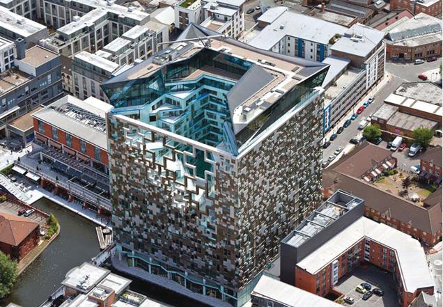


Of the other building’s on the shortlist, MAKE’s Cube thing, certainly stand's out as pretty hideously gauche. While it definitely deserves derision, the cream of the crap has got to be the Burns Monument Centre...


I’ve posted above a picture of the grandiose, original monument which was sadly damaged in a fire. Below is the new bicycle shed-type arrangement, designed by the local authority to “restore” the monument. It’s so crude and frankly such a laughably mundane use of a particularly flamboyant, historic folly, that I actually don’t know where to start. It’s just wrong.

However, I really think it needs to be seen in context of what was there before, because in a weird way, I suspect it’s utlilitarian, traditional materialled, non-design would not be considered offensive to many members of the general public. Probably less so than more modern styles.


Given the current political climate, with talk of schools in re-used industrial buildings and community led housing initiatives, I think the real threat to architecture is not wanky, ego-driven mega-developments, but buildings that don’t require architects at all.

It’s not for me to say how the architectural profession should present itself in public and maybe my points are irrelevant to the organisers of the Carbuncle Cup. As it happens I’m quite pleased that bad developments are being shown up (I’ve got one or two buildings in mind for nominating next year), but as an interested outsider, I can’t help but think that the coverage of the Carbuncle Cup probably isn’t doing the profession any real favours.
Friday, 6 August 2010

Jubilee Campus, Juxtapositions and Plonk-architecture


A couple of weeks ago, the East Midlands Branch of the Landscape Institute held their AGM at Nottingham University’s Jubilee Campus. Prior to the main event, where everyone tries to avoid being voted onto the committee (I must have lost again, as I’m still Branch Secretary), we had tour of the Campus itself.

WARNING! The following Blog post contains graphic images of Landscape Architects.


While I’d passed by the campus a few times, and seen plenty of pictures in the architectural press coverage (much of which was highly critical), I was very keen to see it for myself. Contrary to many, I actually thought that the new buildings looked pretty cool.


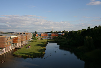
What I hadn’t really remembered, is that the buildings by MAKE Architects are only a recent addition to the site. The original campus masterplan was produced by Michael Hopkins and Partners, who also designed the first phase of buildings, and opened in 1999. The scheme is based upon sustainable principles and was developed on a brown field site (the former Raleigh bicycle factory). The Djanogly LRC , with it’s single spiralling floor, is the most recognisable building here (and where I took a few rooftop snaps). However, the real focus of the scheme is on the artificial lakes which run through the heart of the campus.


The green credentials are also pretty impressive ; the lakes are used as a giant heatsink, whilst everywhere you look there are ventilation chimneys, swales, photovoltaic cells and green roofs.


Actually, I’m a little unsure about the green roofs – the planting reminds me of the sort of thing you see sprouting from a disused runway.


Ambling along the waterside concourse is a very pleasant thing to do on a sunny, summer evening. Looking over the water to the backdrop of reeds, trees and wildlife – you could almost forget you’re in Nottingham! Whilst timber cladding has become rather passé, the palette of materials used is simple, well balanced and tasteful. You would feel proud to be a student here.


It’s actually some way into the campus before I get my first glimpse of MAKE’s phase 2 buildings, and then rather strangely half hidden behind a building and some car parking. The new buildings are certainly striking.


As you continue south, a new pathway leading to the phase 2 campus, cuts across the main concourse. Where the Hopkins designed campus is all calm and simplicity, this new path is a riot of colours, funky paving, water-features, stone cubes, trees and brightly coloured planting. Someone with a more base mind than I, could draw some sort of significance from the way this path ends in a fountain on the otherwise tranquil lake...


Look it's "Aspire" (it’s a pun, it’s an inspiration, it’s a metaphor, it’s a giant ice cream cone).


Wandering round the campus, I had found myself defending MAKE’s buildings to a former colleague, who was convinced that they represented the worst excesses of “starchitects”. I cited Laver’s Law, that Universities should be about new, and optimistic, and finally that they are just ahead of their time. But as I get closer, I begin to doubt my arguments.


Close up and I can begin to understand why I want to like these buildings. Part of me is still the small child that grew up watching sci-fi films and is desperately disappointed by the modern world. Where are the flying cars? Where are the discos with uninhibited space chicks dancing in silver mini-skirts? And where is the lunar colony? MAKE’s buildings are a business park approximation of how I imagined 2010 should look and kind of wish it did. Unfortunately, for all their sci-fi styling, there are some seriously big problems with these buildings. For a start...


... they face straight onto a car park and the arse-end of other buildings (again I can imagine some might to want to use a crude metaphor for this. Not I, natch). Landscape architecture is all about context and setting, whereas these buildings give no regard to their setting and only seem to interact with what immediately surrounds them (notice how the planting is limited to just the building curtilage). When our guide “explained” the thinking behind MAKE’s design I could actually feel myself getting angry. Apparently, the coloured bands represent the underlying strata, planting is inspired by American studies, whilst the east-west axis extends the site... Rubbish. It’s just empty post rationalisation for doing whatever the hell they like.


Plonk architecture isn’t just confined to this scheme. Was the Gherkin designed especially for Swiss Re, or had it been sitting on Ken Shuttleworth’s (Mr MAKE) drawing board, just waiting for an somewhere to stick it? While architecture can create a new character for a place, I think a design is nearly always more successful when it gives some regard to it’s context and setting. Unfortunately, it seems to me that too many designers, driven by their ego, set out to create their own context. Worse still, I think that there is actually a school of thinking in architecture particularly, that wants to actively go against, subvert or contrast with it’s surroundings, because “Hey, it’s a juxtaposition!”


The Hopkins masterplan gives the campus a clear, simple layout and a calm, elegant environ, which MAKE completely disregard .While I want to love MAKE’s addition to the Jubilee campus for it’s futuristic style, it’s contempt for the surrounding context is everything I detest in the design of our built environment. Some may argue that taken out of context these buildings are terrific, but context is everything when dealing with the world we live in.


Weirdly though, as we trudged back to the car park, I found myself wishing that more buildings were shaped like aerodynamic wedges and clad in exotic metails. A few space chicks in mini skirts wouldn’t go amiss either.